Master Henry’s started as a blank canvas — no name, no branding, just the ambition to create a sweet shop that felt exciting both on the high street and online.
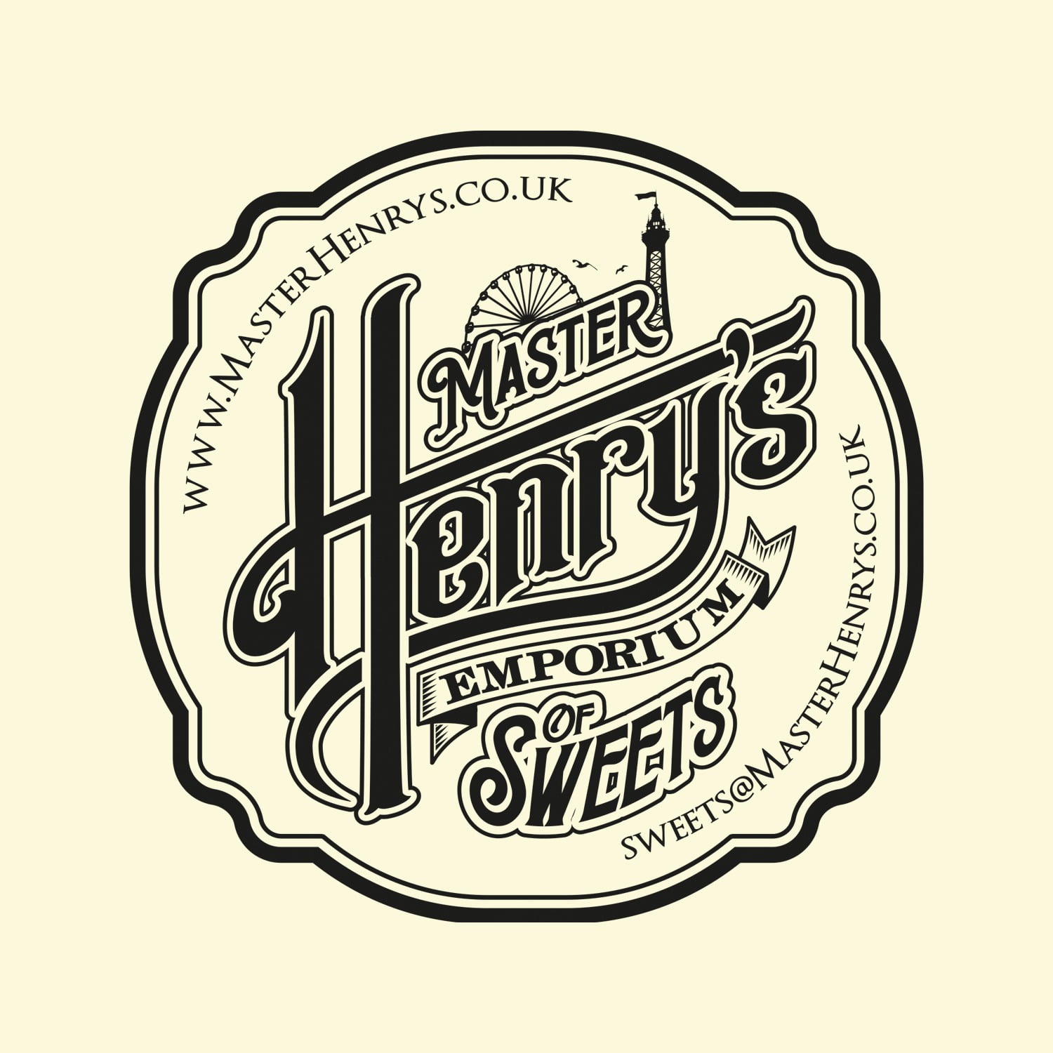
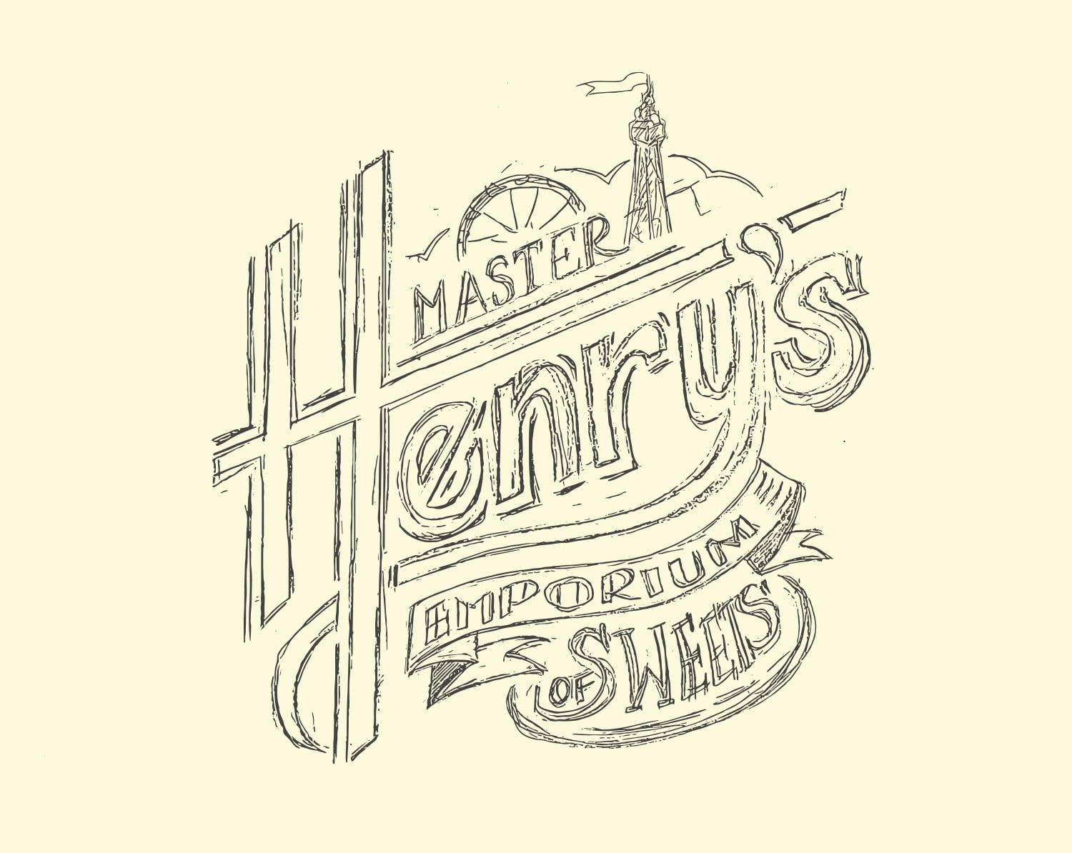
In the early stages of the project, one small detail stood out. Our Creative Director noticed the way the client naturally wrote the letter “H” and that simple, personal mark became the starting point for the entire identity. From there, the name, logo and visual direction began to take shape, creating a brand that felt distinctive, playful and full of personality from day one.
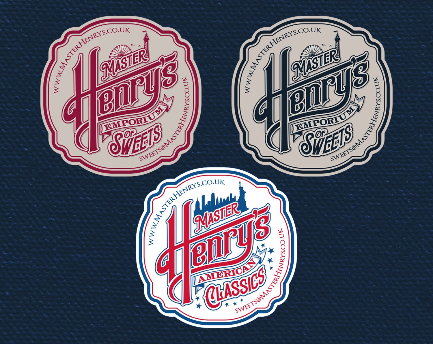
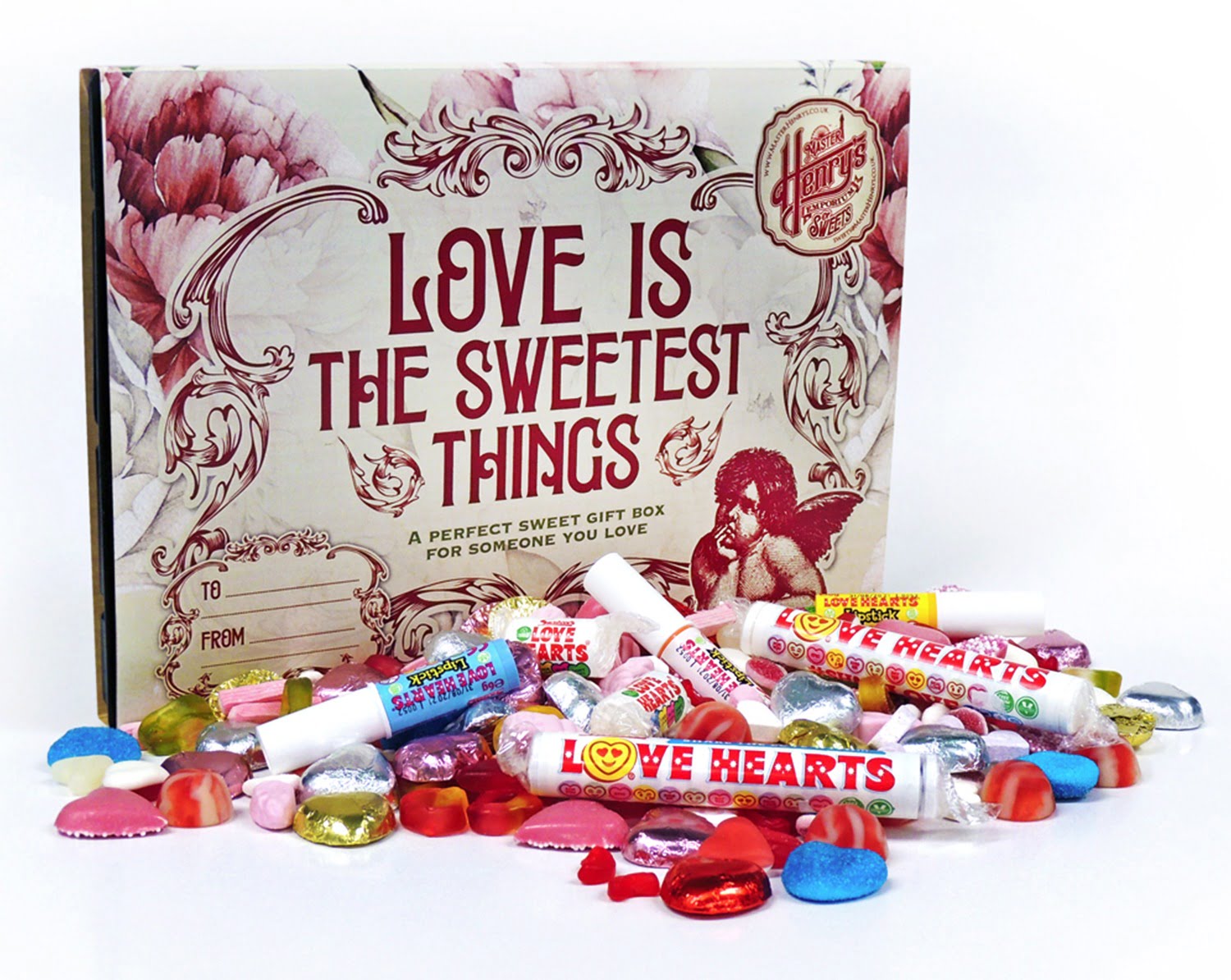
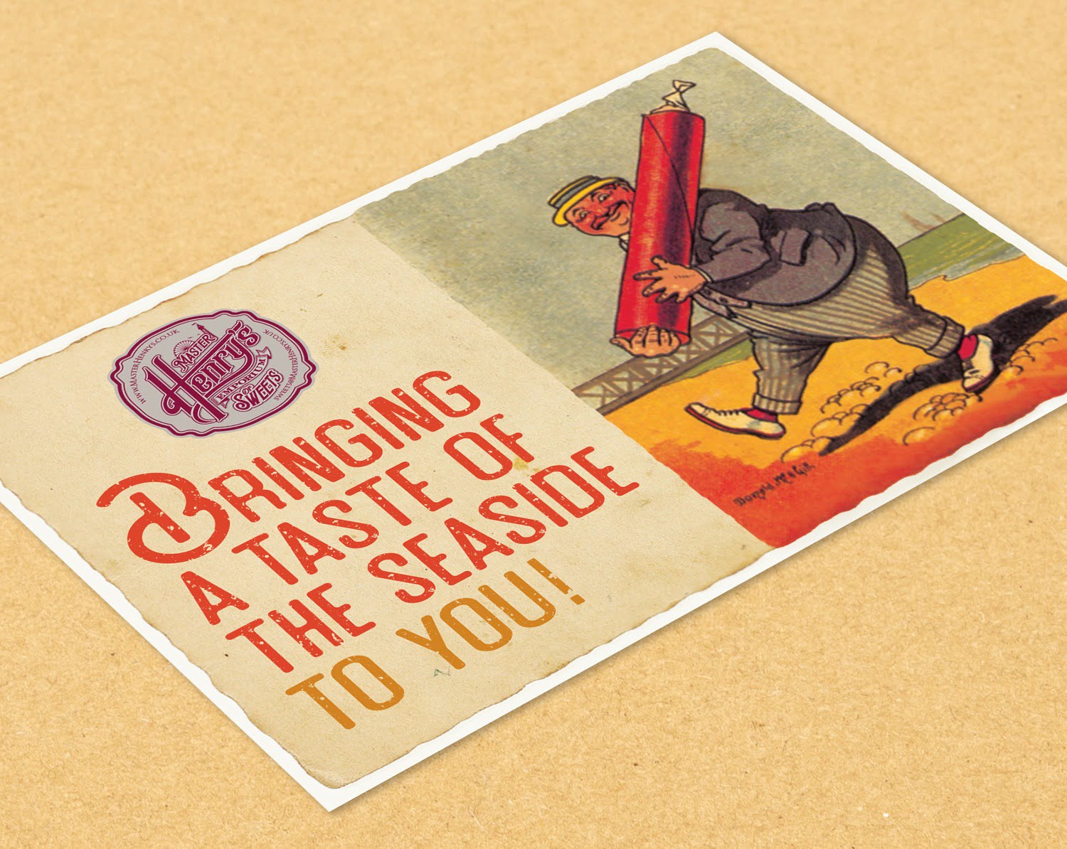
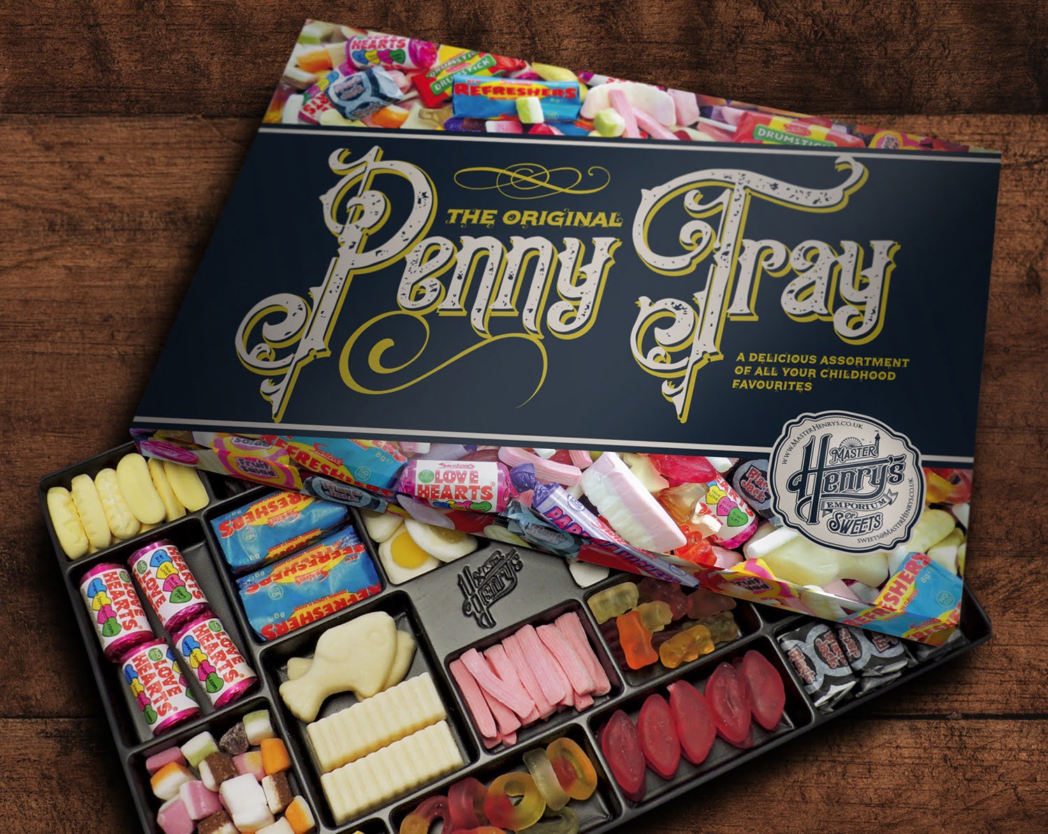
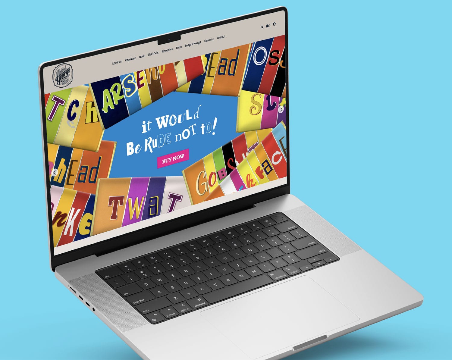
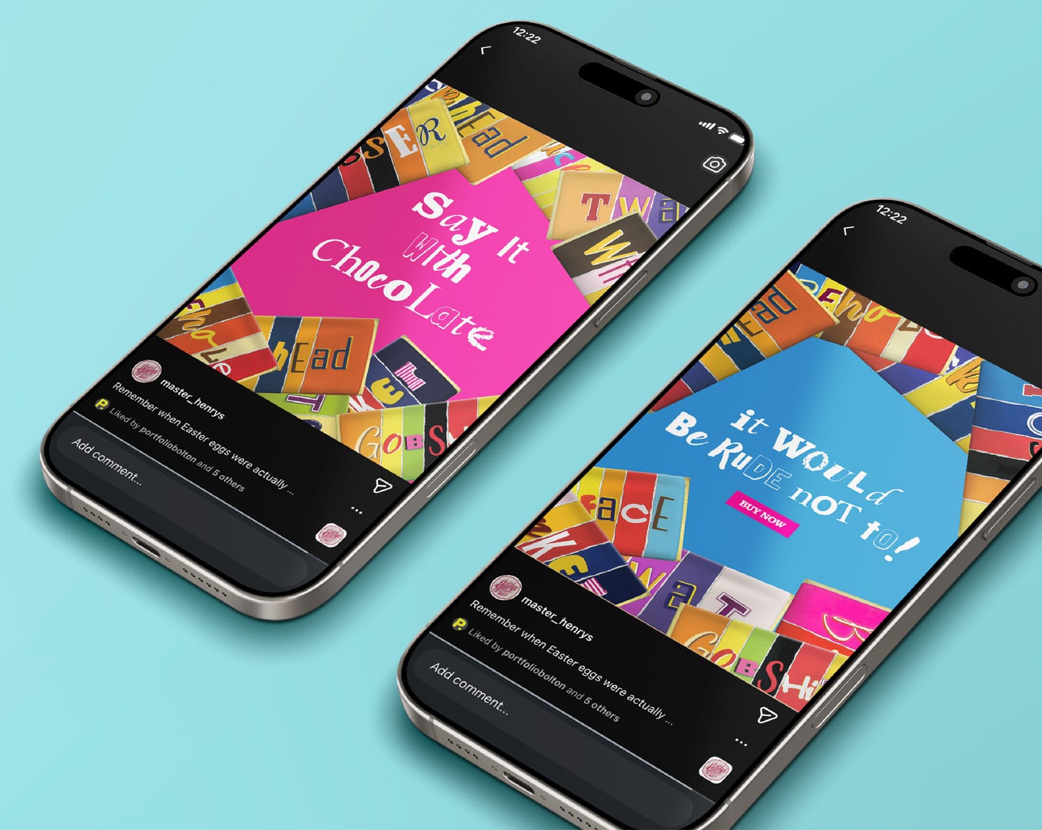
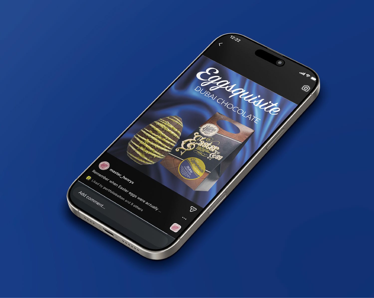
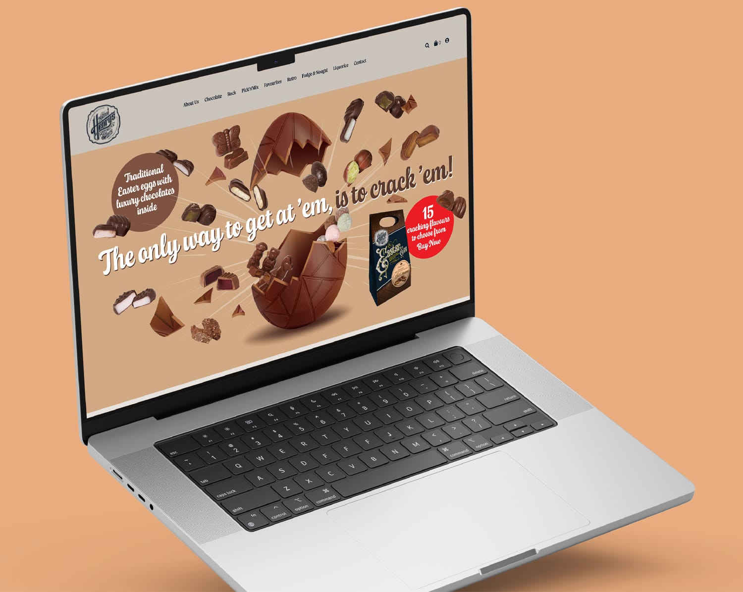
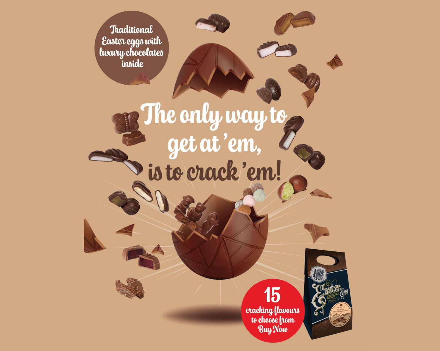
As the brand evolved, so did the creative. What began as an initial concept quickly expanded into a full brand world — from packaging and labels to signage, POS materials, digital assets and the e-commerce website. Every touchpoint was designed to feel consistent, characterful and instantly recognisable.
This has been an ongoing journey, and one we’ve loved being part of. The work continues to grow alongside the business, with new products, ideas and creative developments constantly building on the foundations of the original brand.

See more work like this that we've created.
Contact us today to arrange a free no obligation quotation for your next project. Please complete the form and one of our team will contact you as soon as possible.
Alternatively contact us on 01204 383822 for an immediate response.